
I used to think paint color did not matter much until I repainted my living room a bright white and realized within a week that the room felt cold and a little harsh, especially in the evening. After trying a few samples on the wall and living with them for a couple days each, I landed on a soft warm gray, and the whole room instantly felt calmer, like a place I actually wanted to sit and unwind in. Paint color has a bigger effect on mood than most people expect, and a calming shade can turn a living room into the kind of space where you actually relax instead of just passing through. Below are 23 paint colors that bring a soothing, settled feeling to a living room, along with notes on lighting, finish, and how to pair each one so it looks its best in your own space.
1. Soft Sage Green
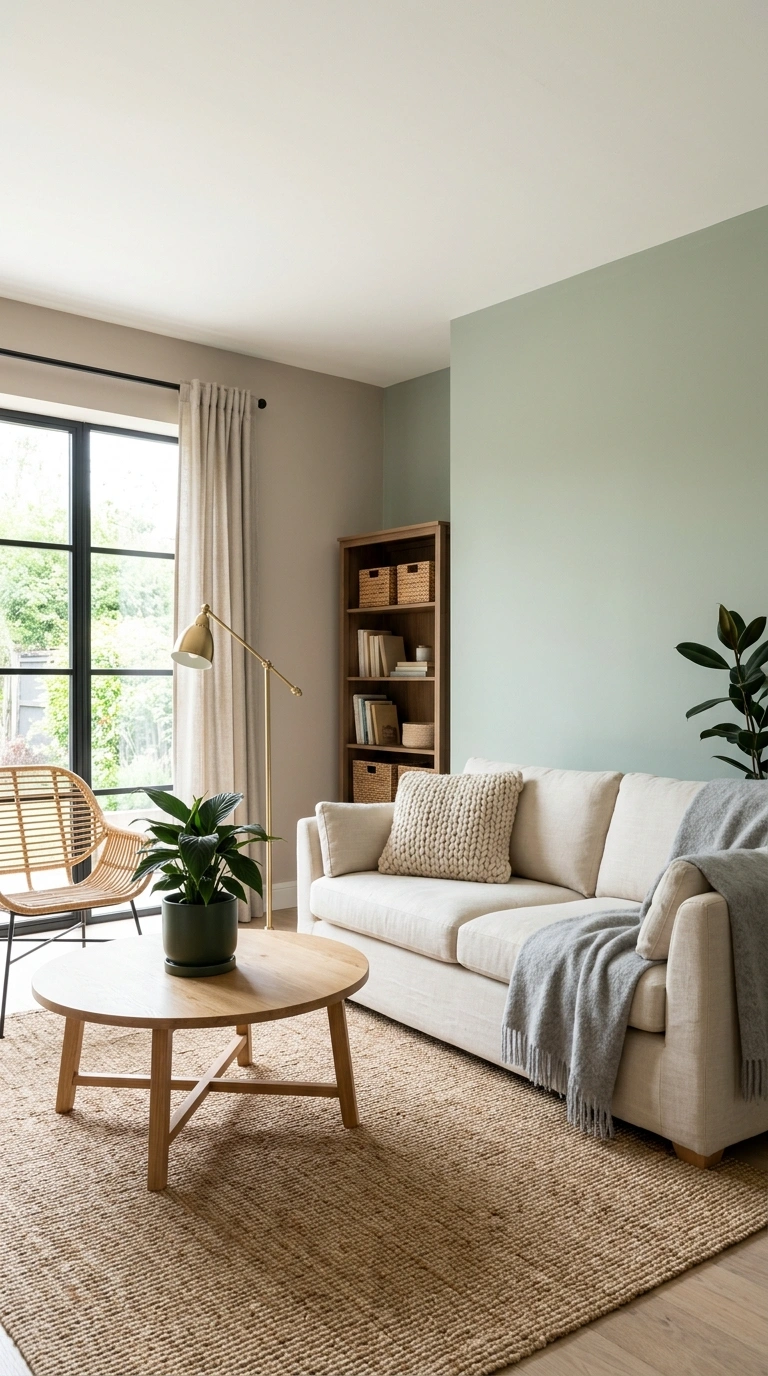
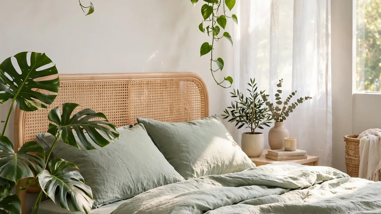
Sage green has become a favorite for living rooms because it reads as calm and grounded without feeling cold or flat like some grays can. This color works especially well on rooms that get a good amount of natural light, since sage can lean a bit gray in dim rooms and a bit more green in bright ones. Pair it with warm wood tones, like a natural oak coffee table or rattan accents, to keep the room feeling cozy rather than sterile.
Use an eggshell or matte finish on the main walls to keep the color soft and avoid harsh reflections, and consider a slightly darker shade of the same green on trim or a fireplace surround for subtle depth. Sage pairs beautifully with cream, soft white, and warm brown furniture, and it looks especially good with brass or matte black hardware. This color works in both older homes with lots of trim detail and newer, simpler spaces, which is part of why it has stayed so popular for calming living rooms.
2. Warm Greige Tone
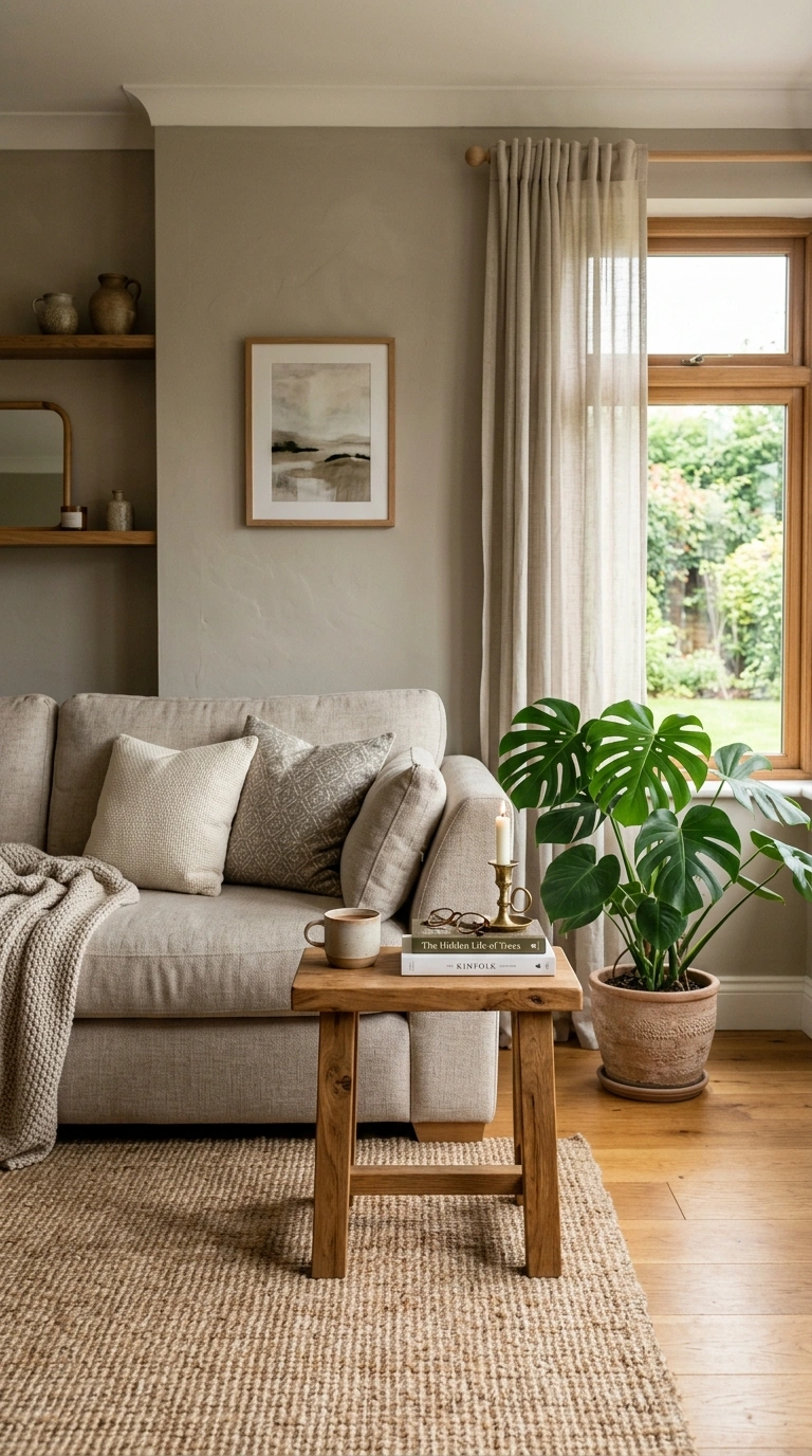
Greige, a blend of gray and beige, is one of the most versatile calming colors because it never feels too cold or too warm, sitting right in the middle. This makes it a safe and soothing choice for living rooms with mixed lighting throughout the day, since it does not shift dramatically the way pure gray or pure beige sometimes can under different bulbs.
Choose a greige with warm undertones if your room gets a lot of natural light, since cooler light can sometimes make greige look slightly purple or muddy. Pair the walls with warm neutral furniture, woven textures, and a few deep green plants to keep the room feeling alive rather than flat. A satin finish works nicely on greige walls since it adds a slight sheen without looking glossy. This color works well as a whole-room wall color and also looks calming when used just below a chair rail with white above it.
3. Muted Dusty Blue
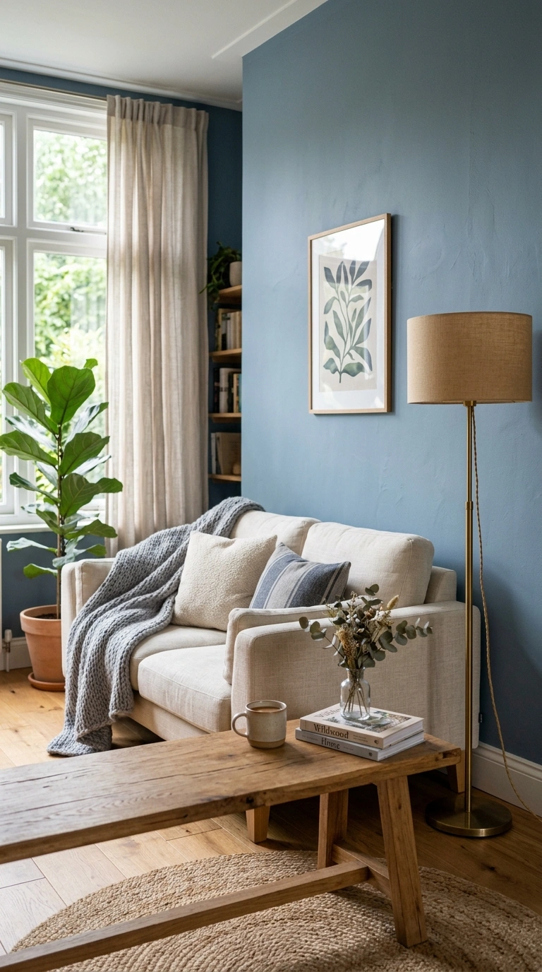
A soft, dusty blue with gray mixed in creates a calm, almost sky-like feeling in a living room without leaning too cold or too playful like brighter blues can. This shade works particularly well in rooms used for reading or relaxing in the evening, since blue tones are known to have a naturally soothing effect on most people.
Use this color on all four walls for a fully immersive calm feel, or paint just one accent wall behind the main seating area if you want a lighter touch. Pair dusty blue with cream, soft gray, and natural wood tones to keep the room feeling warm despite the cool wall color. A matte or eggshell finish suits this shade best, since a glossier finish can make blue feel more stark. Add brass lighting fixtures or warm metal accents to balance out the coolness of the wall color and keep the whole room feeling inviting.
4. Pale Oatmeal Beige
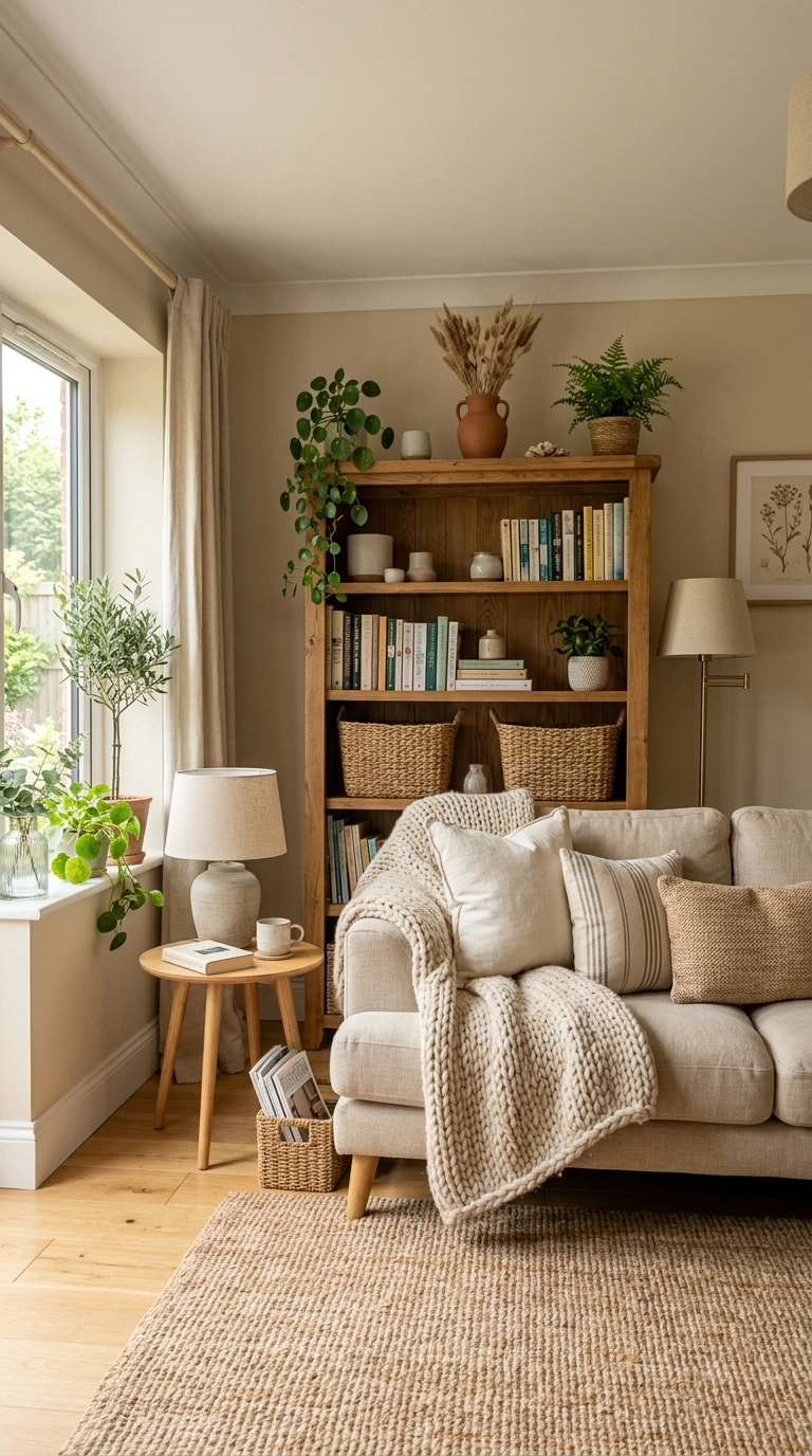
Oatmeal beige is a soft, warm neutral that feels calm without being boring, which makes it a great choice for living rooms meant to feel like a cozy retreat. Unlike stark white or cool gray, oatmeal has enough warmth to feel inviting even on cloudy days or in rooms with limited natural light.
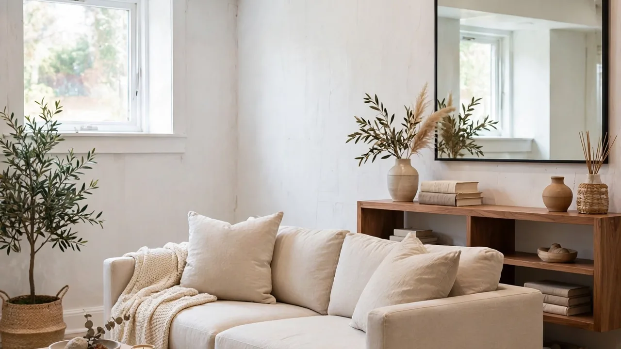
This color pairs especially well with layered textures, like a chunky knit throw, a jute rug, and linen curtains, all of which enhance the relaxed, natural feeling the color creates. Use an eggshell finish for a soft, low-glare look that still wipes clean easily. Oatmeal beige also works beautifully as a backdrop for gallery walls or bookshelves, since it lets colorful items stand out without competing with a bold wall color. This shade is a good pick for anyone who wants a calming room that still feels warm and lived in rather than sparse.
5. Soft Cloud Gray
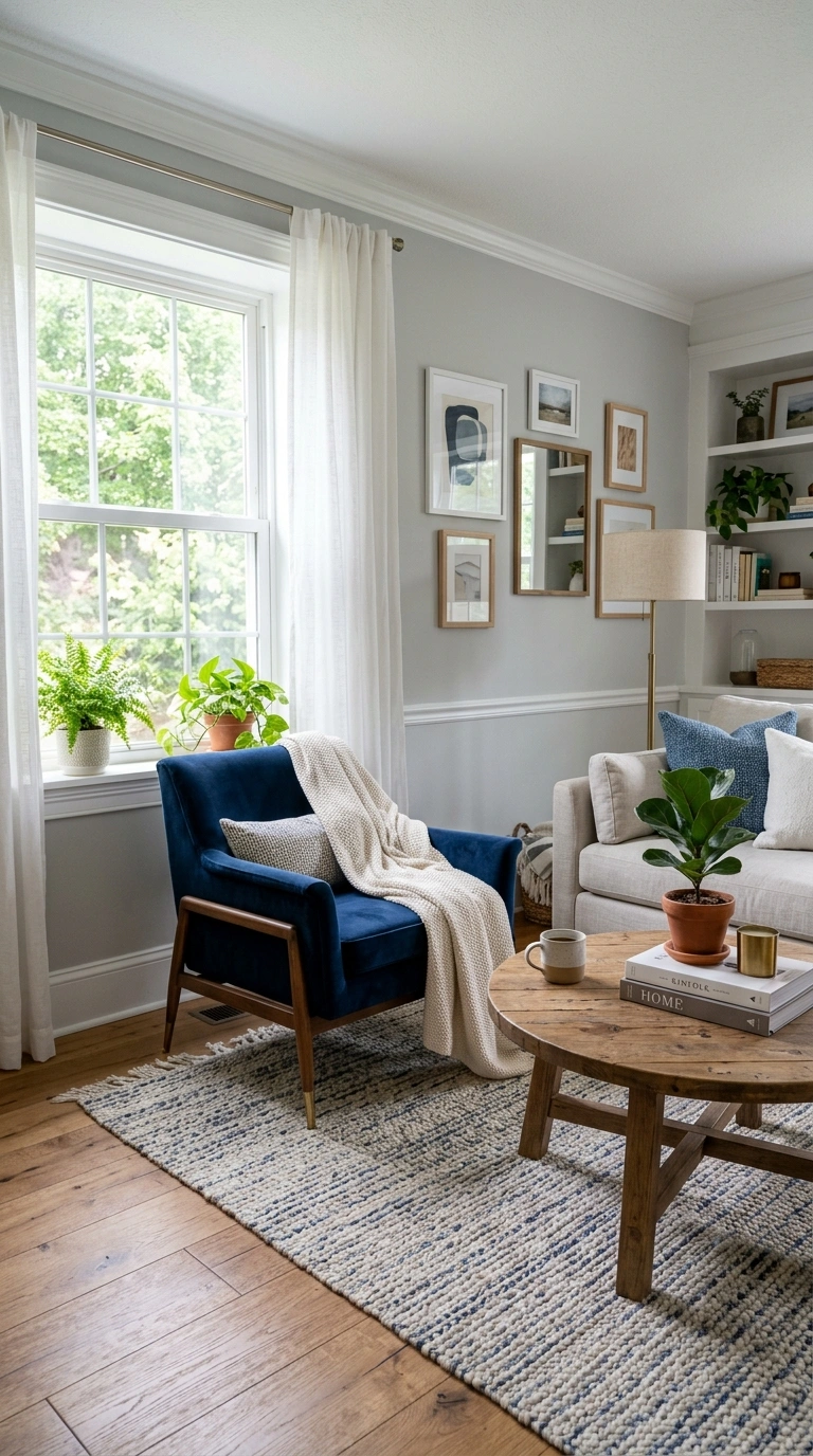
A soft, light gray with a hint of warmth creates an airy, calm backdrop that works in almost any living room style. This shade avoids feeling as cold as blue-based grays sometimes do, making it a comfortable middle ground for people who want a neutral wall color that still feels relaxing rather than clinical.
Cloud gray looks especially good with white trim and ceilings, creating a soft, cohesive look throughout the room. Pair it with navy, blush, or warm wood furniture to add a bit of color without overwhelming the calm base tone. A flat or matte finish works best here since it keeps the color looking soft rather than reflective. This shade also photographs beautifully in natural light, which is part of why it remains such a popular choice for living rooms that get used for both relaxing and entertaining guests throughout the week.
6. Warm Terracotta Blush
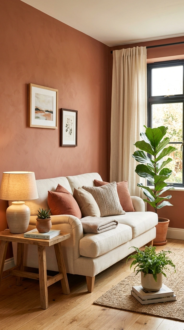
A muted terracotta with a soft blush undertone brings warmth into a living room while still feeling calm rather than bold or overwhelming. This color works surprisingly well as a full wall color in rooms with plenty of natural light, since the warmth of the shade pairs nicely with sunlight streaming through windows during the day.
Use this color on a single accent wall if you want a subtler effect, positioning it behind the main sofa or around a fireplace to create a natural focal point. Pair terracotta blush with cream, soft white, and natural wood furniture to let the warm tone stand out without feeling too intense. A matte finish suits this shade especially well, softening the color further. This is a great option for anyone who wants a living room that feels warm and calming at the same time, rather than choosing between the two.
7. Muted Lavender Gray
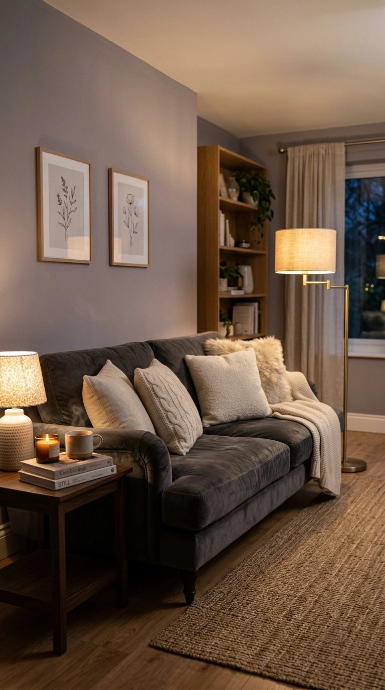
A soft lavender with plenty of gray mixed in creates a calm, slightly moody feeling in a living room without leaning too pink or too purple. This shade works particularly well in rooms used mostly in the evening, since the color takes on a soft, dreamy quality under warm lamp light.
Pair this color with charcoal, cream, and soft pink accents to build a cohesive, calming palette throughout the room. A soft velvet sofa in a neutral tone looks especially good against lavender gray walls, adding texture without competing with the wall color. Use an eggshell finish to keep the color soft and avoid any unwanted shine. This shade works particularly well in living rooms with large windows, since natural light helps keep the color from feeling too heavy, while lamps and warm bulbs in the evening bring out its softer, moodier side.
8. Soft Butter Cream
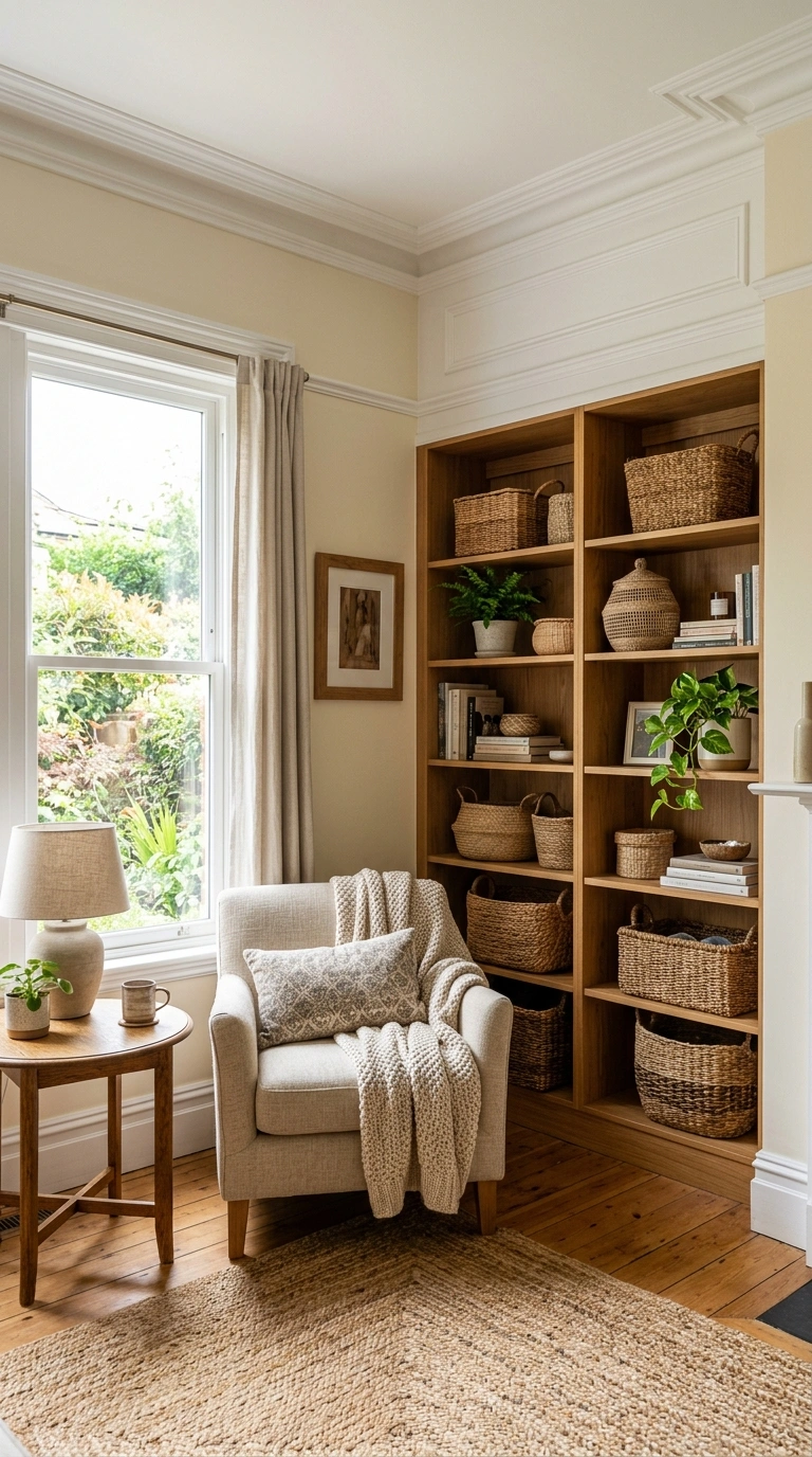
A very soft, warm cream with just a touch of yellow creates a gentle, calming glow in a living room, especially one that does not get a huge amount of natural light. This shade avoids the starkness of bright white while still feeling light and airy rather than heavy or dark.
Pair butter cream walls with warm wood furniture, woven baskets, and soft white trim to keep the whole room feeling bright and cohesive. This color works especially well in older homes with lots of architectural detail, since it highlights molding and trim without creating harsh contrast. Use a satin or eggshell finish for a subtle glow that still feels soft rather than shiny. This shade is a good choice for anyone who wants their living room to feel calm, warm, and a little bit sunny even during darker months of the year.
9. Deep Forest Green
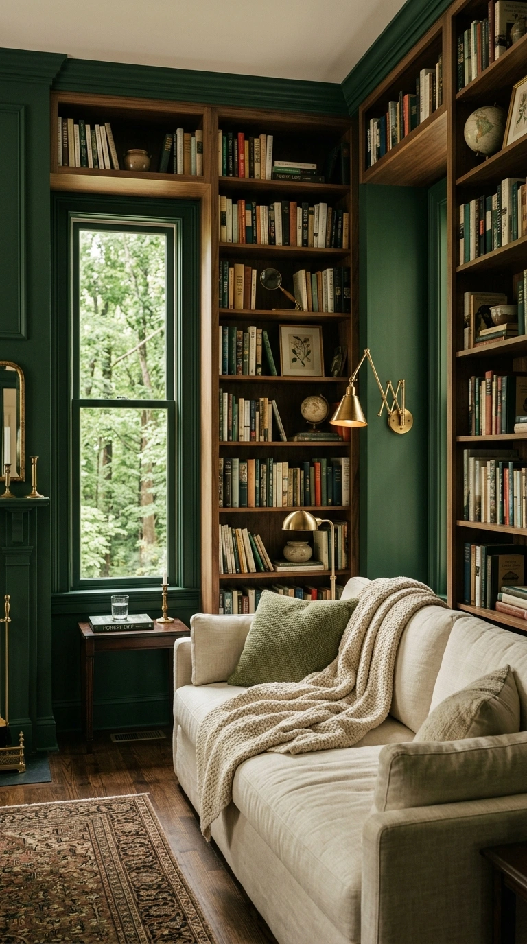
A deep, muted forest green might seem like a bold choice, but in the right setting it creates one of the most calming, cocoon-like living rooms possible. This color works especially well in rooms with good natural light or strong architectural features, like built-in bookshelves or a fireplace, since the deep tone gives the space a rich, grounded feeling.
Use this shade on all four walls for a fully enveloping effect, paired with warm wood furniture, brass lighting, and soft cream textiles to keep the room from feeling too dark or heavy. A matte finish works best on deep colors like this, since it absorbs light softly rather than reflecting it. This color pairs beautifully with plants, since the greens naturally complement each other. This is a great pick for anyone who wants a living room that feels like a quiet retreat rather than just another neutral space.
10. Warm Clay Pink
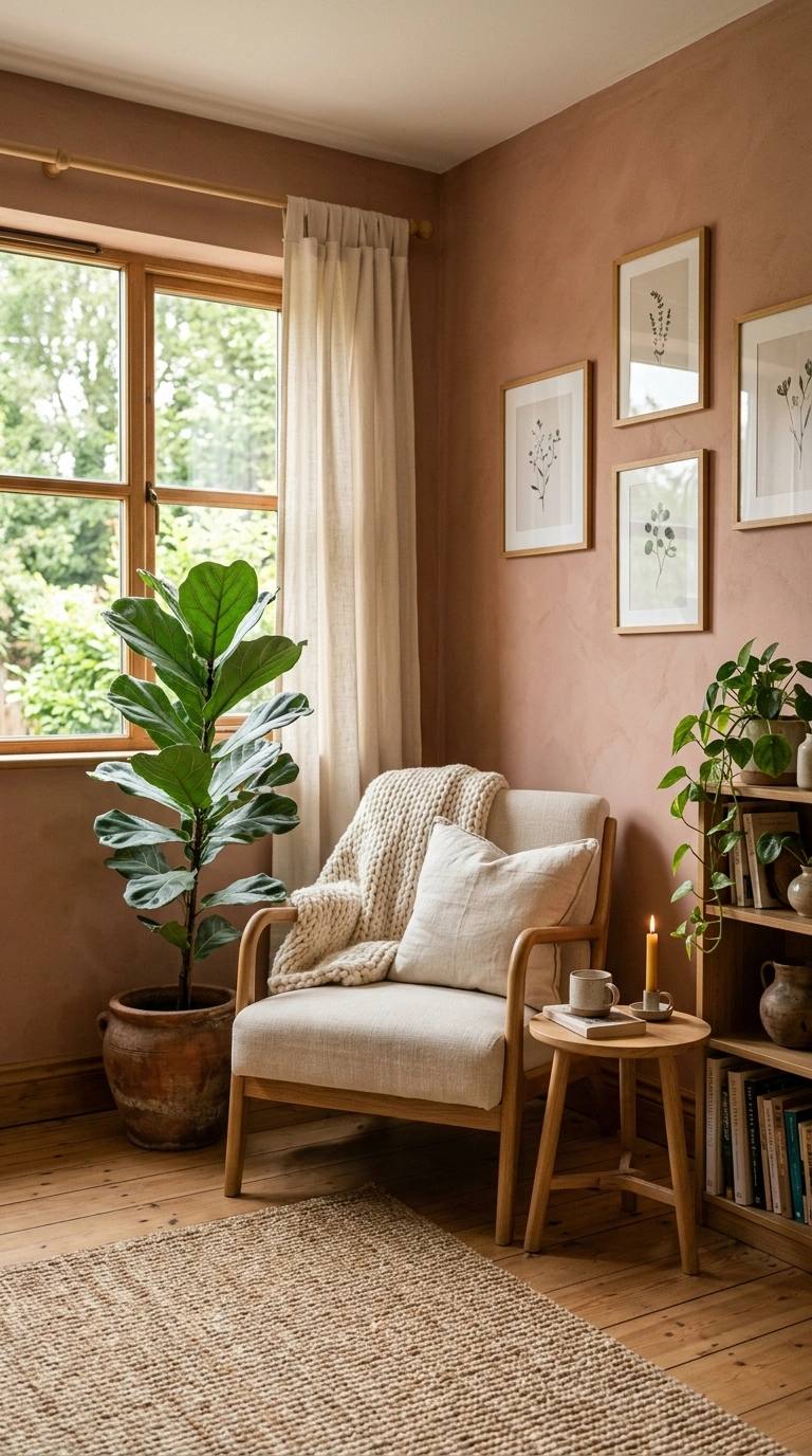
A muted, warm clay pink brings a soft, grounded feeling into a living room without reading as overly feminine or bright. This color works especially well as a full wall color in smaller living rooms, since the warmth of the tone makes the space feel cozy rather than cramped.
Pair clay pink with warm wood tones, cream textiles, and brass or matte black accents to create a balanced, calming palette. This shade also looks beautiful alongside deep green plants, which help ground the warmth of the wall color. Use an eggshell finish for a soft, low-glare look that still feels a bit elevated. This color works particularly well in rooms that do not get a ton of direct sunlight, since the warmth of the tone naturally brightens the space without needing strong light to look its best throughout the day.
11. Soft Powder Blue
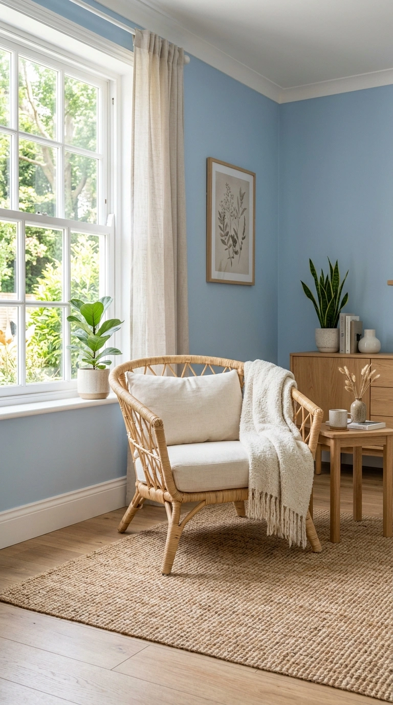
A very soft, powder blue creates a gentle, nursery-like calm in a living room without feeling babyish when paired with the right furniture and accents. This color works especially well in smaller living rooms, since light blue tends to open up a space visually rather than making it feel smaller.
Pair powder blue walls with white trim, natural wood furniture, and woven textures like a jute rug or rattan chair to keep the room feeling grounded and warm despite the cool wall color. A flat or matte finish works best here, keeping the color soft rather than glossy. This shade looks especially calming in rooms used for morning coffee or reading, since the soft blue pairs nicely with natural daylight. This is a good option for anyone who wants a light, airy living room that still feels soothing rather than sterile.
12. Muted Olive Green
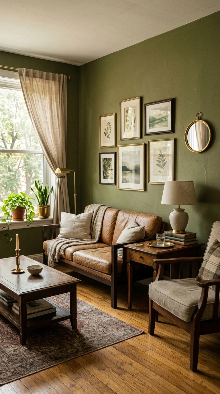
A soft, muted olive green brings an earthy, grounded calm into a living room, working especially well in spaces with warm wood floors or natural materials throughout. This color sits between green and brown, giving it a slightly more neutral feel than brighter greens while still bringing in a sense of nature.
Pair olive green walls with cream, warm wood, and rust-colored accents to build a cohesive, earthy color palette. This shade also looks beautiful with vintage or antique furniture, since the muted tone complements aged wood and brass finishes naturally. Use an eggshell finish for a soft, subtle sheen. This color works particularly well in living rooms with a lot of natural texture, like linen curtains, woven baskets, and wood furniture, since the wall color ties all those earthy elements together into one calm, cohesive space.
13. Warm Almond Tan
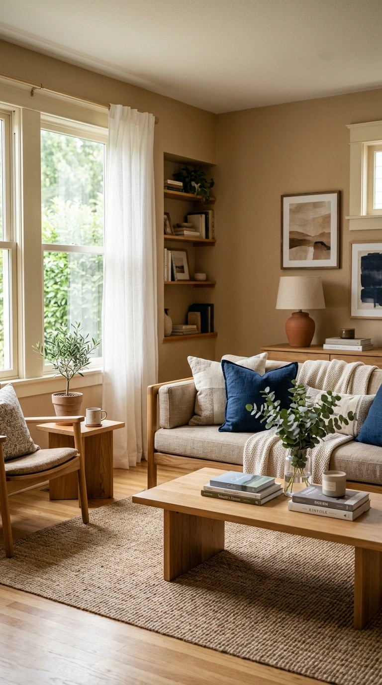
A soft, warm almond tan creates a gentle, calming neutral that feels a bit richer than beige without becoming as bold as brown. This shade works especially well in living rooms that need a bit more warmth and coziness, particularly in colder climates or rooms that face away from direct sunlight.
Pair almond tan with cream, soft white trim, and warm wood furniture to keep the room feeling cohesive and inviting. This color also pairs nicely with deep green or navy accents if you want a bit more contrast without straying from the calming feel of the room. Use a satin finish for a subtle warmth and glow on the walls. This shade works well in both traditional and modern living rooms, since the warmth of the color softens sharp, modern furniture lines while also complementing more classic, detailed decor styles.
14. Soft Stone Gray
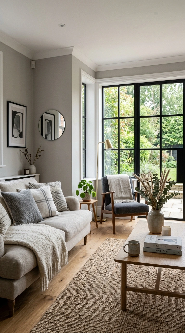
A soft, warm-toned stone gray creates a calm, grounded neutral that works in nearly any living room style, from modern to traditional. This shade sits between beige and gray, giving it enough warmth to avoid feeling cold while still reading as a true neutral rather than leaning too far into any one color family.
Pair stone gray walls with white trim, warm wood floors, and a mix of soft textiles like linen and wool to create a calm, layered living room. This color also works well with black metal accents, like window frames or light fixtures, for a bit of modern contrast. Use an eggshell finish to keep the color soft without looking flat. This shade is a reliable, calming choice for anyone who wants a neutral living room that still feels warm and welcoming rather than plain or cold.
15. Pale Seafoam Green
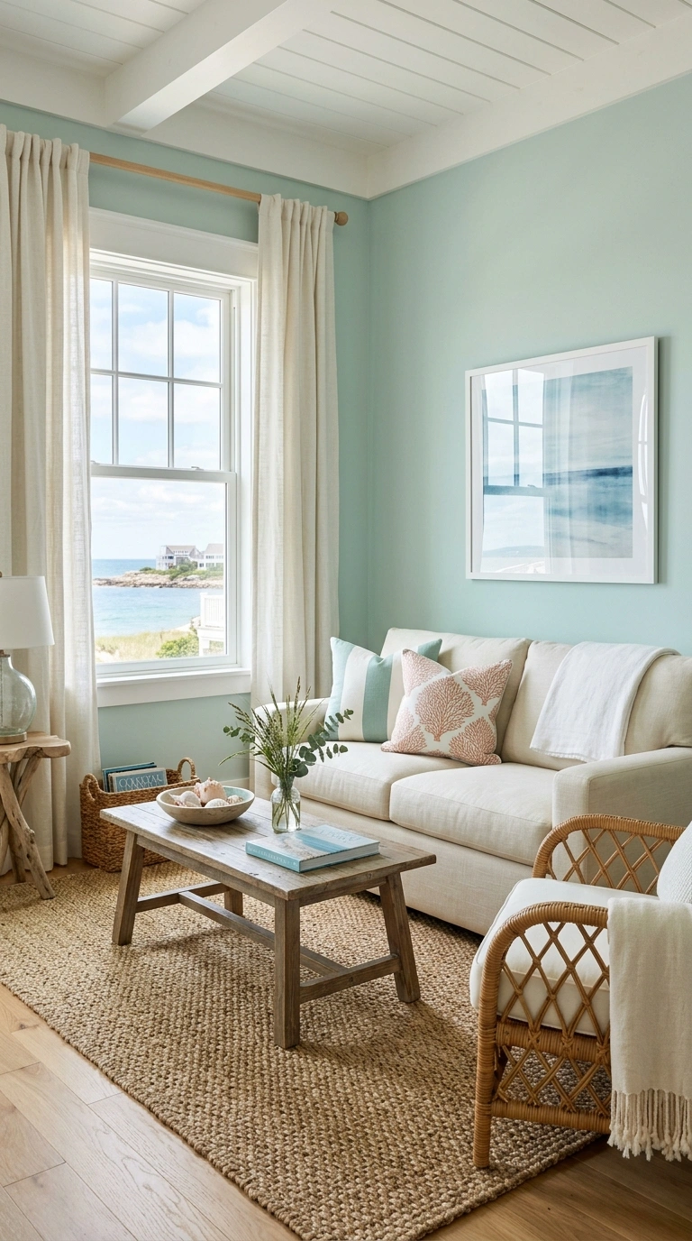
A very pale seafoam green, almost gray in its softness, creates a light, breezy calm in a living room, especially one near a window or in a coastal-style home. This color works well in smaller rooms since the pale tone keeps the space feeling open and airy rather than closed in.
Pair seafoam green with white trim, natural wood tones, and woven textures like a seagrass rug or linen curtains to build a relaxed, coastal-inspired living room. This shade also looks lovely with soft blue or sandy beige accents if you want to build out a slightly larger color palette. Use a matte or eggshell finish to keep the color feeling soft rather than reflective. This is a great choice for anyone who wants their living room to feel like a calm, breezy retreat, even if the home is nowhere near the coast.
16. Warm Taupe Brown
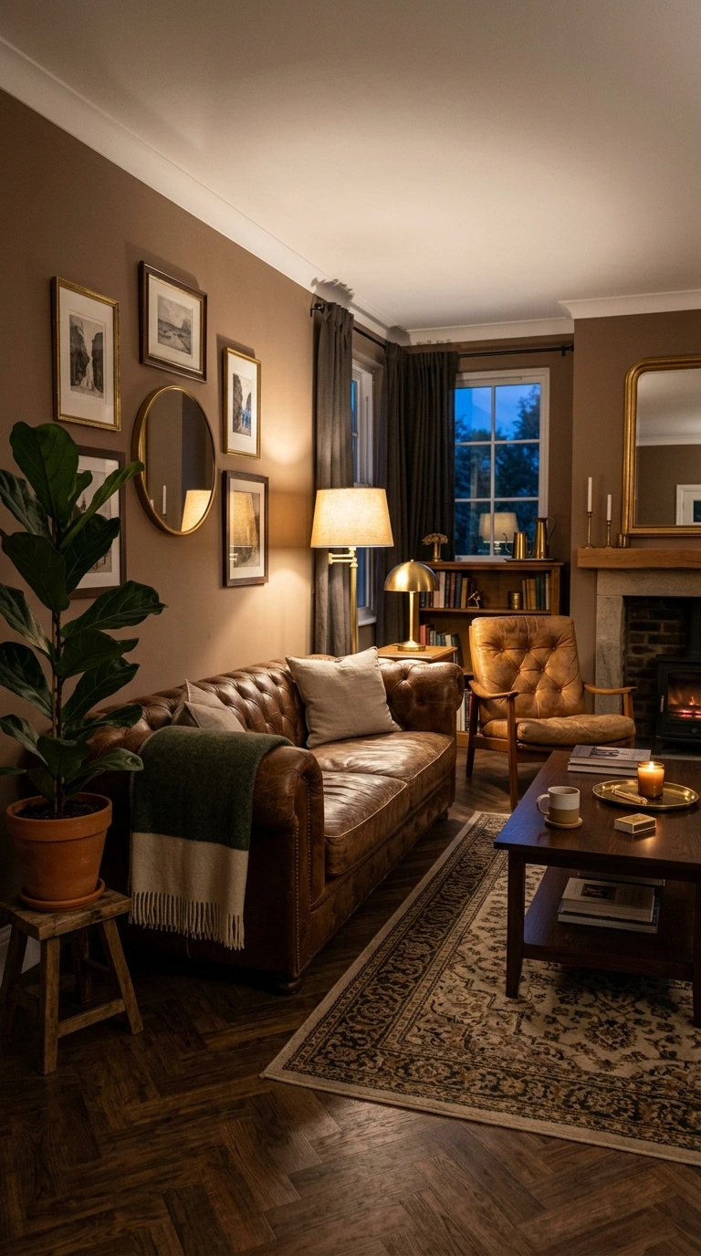
A warm, muted taupe brown creates a cozy, grounded calm in a living room, working especially well in rooms with a lot of natural wood or leather furniture already in place. This shade sits nicely between beige and brown, giving it enough depth to feel rich without becoming too dark or heavy for a main living space.
Pair taupe brown with cream, soft white trim, and brass accents to keep the room feeling warm and inviting rather than dim. This color also works beautifully with deep green plants and warm-toned artwork, since the neutral base lets other elements stand out. Use a satin or eggshell finish to add a soft warmth to the walls. This shade works particularly well in living rooms used often in the evening, since warm lamp light brings out the cozy, grounded quality of the color beautifully.
17. Soft Blush Pink
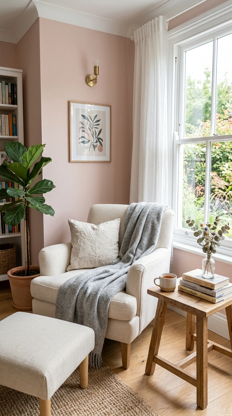
A very soft, muted blush pink creates a gentle, calming warmth in a living room without feeling overly sweet or bright when paired thoughtfully. This shade works especially well in living rooms with a lot of natural light, since the softness of the color needs bright conditions to really show its calming, warm undertone.
Pair blush pink walls with cream, warm wood furniture, and soft gray accents to keep the room feeling balanced and grounded rather than overly soft. This color also pairs beautifully with black or brass metal accents for a bit of contrast against the gentle wall color. Use an eggshell finish for a soft, low-glare look. This shade works particularly well in living rooms that double as a reading nook or a quiet corner of the home, since the color naturally encourages a slower, calmer mood throughout the day.
18. Muted Slate Blue
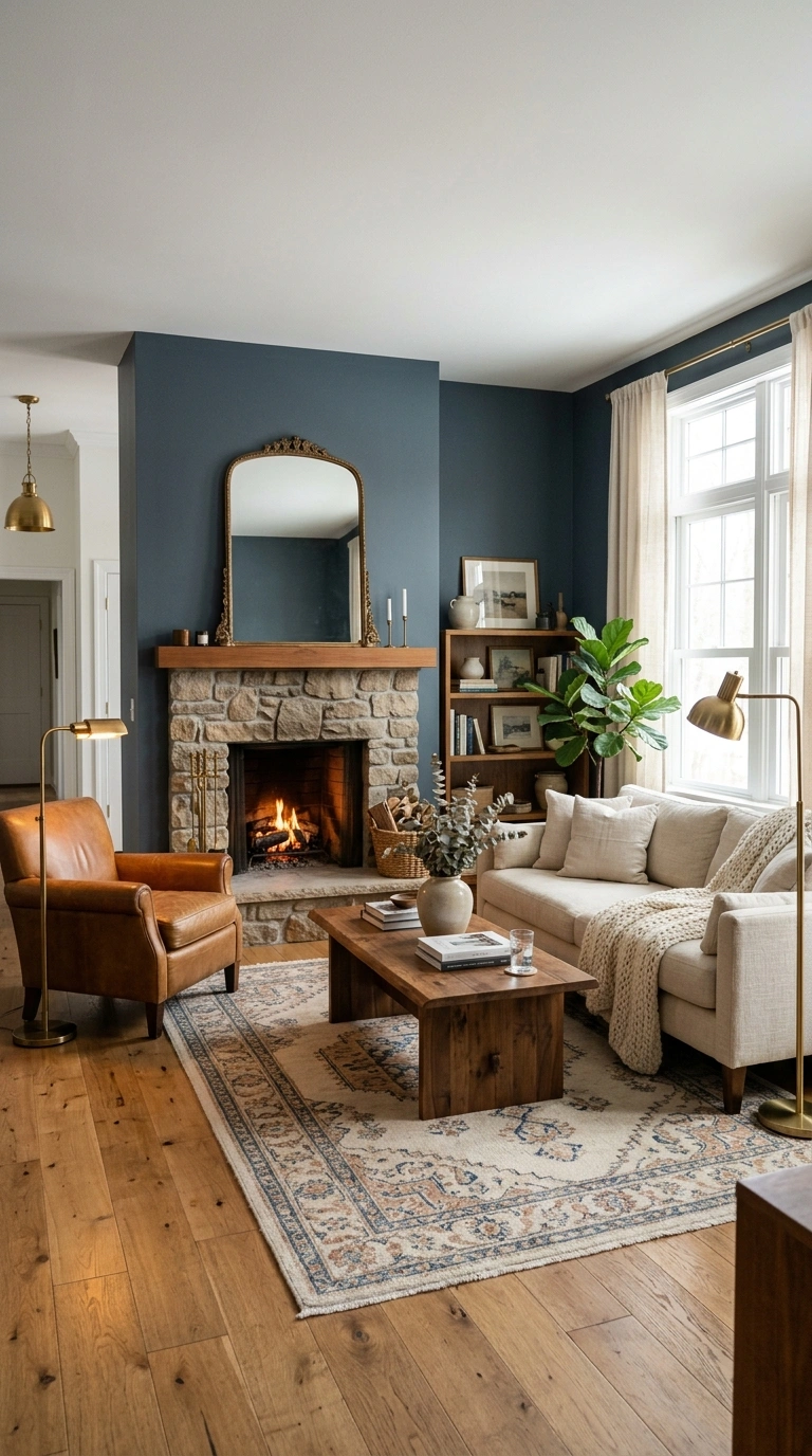
A deep, muted slate blue brings a cozy, enveloping calm to a living room, working especially well in rooms with good natural light or a strong architectural feature like a fireplace. This shade sits between blue and gray, giving it a grounded, sophisticated feel rather than reading as overly bright or playful.
Use this color on all four walls for a fully immersive, calming effect, paired with warm wood furniture, brass lighting, and soft cream textiles to balance out the depth of the color. A matte finish works best on a deep shade like this, softening the overall look of the room. This color also pairs beautifully with black and white photography or artwork, since the neutral wall color lets other pieces stand out. This shade is a great pick for a living room meant to feel like a calm, quiet retreat.
19. Warm Ivory White
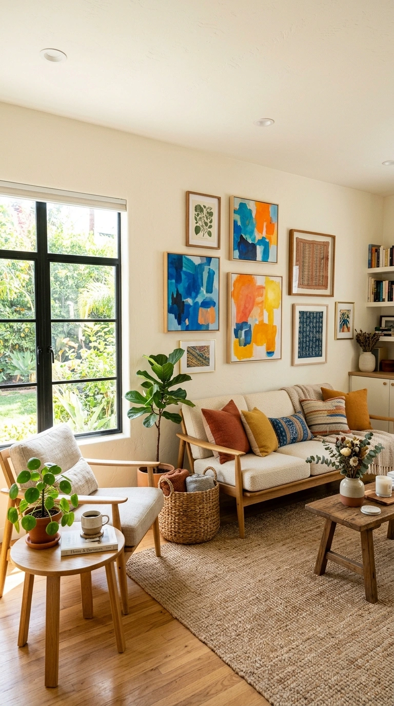
A soft, warm ivory white creates a gentle, calming neutral that avoids the starkness of bright white while still keeping a living room feeling light and open. This shade works well in nearly any room, though it especially shines in spaces with a lot of natural light, since the warmth of the tone keeps the room from feeling too cold or clinical.
Pair ivory white with warm wood furniture, woven textures, and soft neutral textiles to build a calm, cohesive living room. This color also works beautifully as a base for a room with colorful artwork or patterned textiles, since the soft wall color lets other elements take center stage. Use an eggshell or satin finish for a subtle glow. This shade is a reliable, calming choice for anyone who wants a bright living room that still feels warm and inviting rather than sterile or overly bright.
20. Soft Sandstone Beige
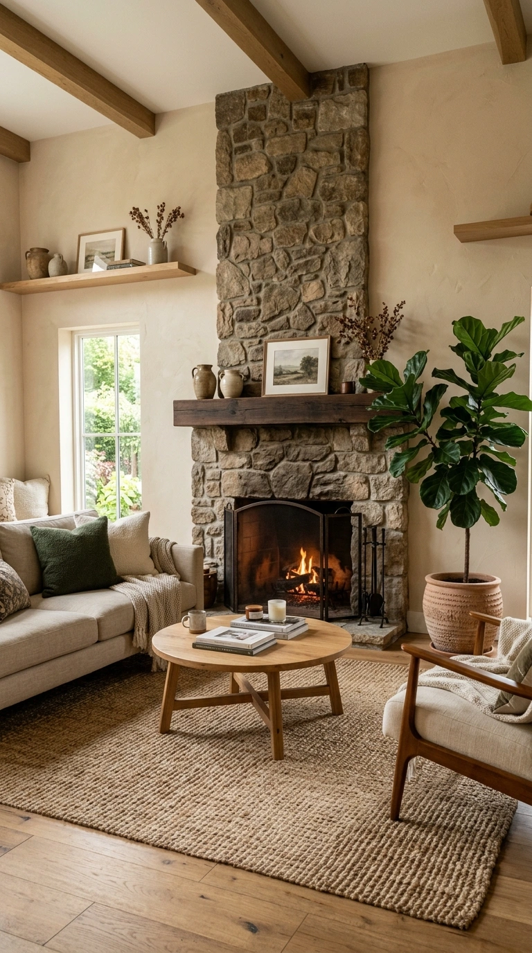
A warm, soft sandstone beige creates a calm, earthy neutral that feels grounded without being dark or heavy in a living room. This shade works especially well in rooms with natural materials like wood floors, stone fireplaces, or woven rugs, since the color naturally complements those earthy textures throughout the space.
Pair sandstone beige with cream trim, warm wood furniture, and deep green plants to build a cohesive, calming palette. This color also looks beautiful with rust or terracotta accents if you want to add a bit more warmth and depth to the room. Use an eggshell finish for a soft, subtle sheen that still wipes clean easily. This shade works well in both modern and traditional living rooms, since the warmth of the tone softens sharp lines while also complementing more classic, detailed furniture and trim work.
21. Deep Navy Blue
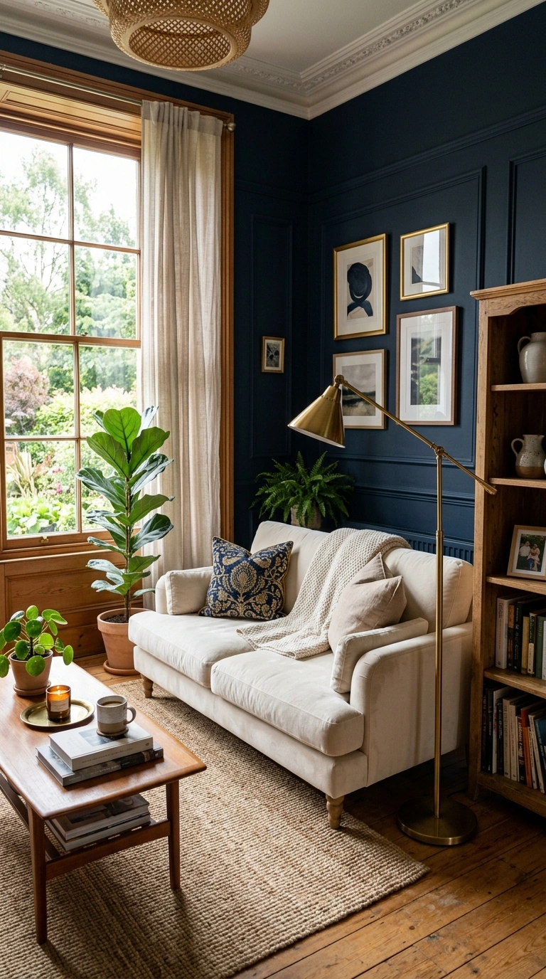
A deep, rich navy blue might feel like a bold choice at first, but in a living room it often creates one of the calmest, most cocoon-like atmospheres possible. This color works especially well in rooms with good natural light or a strong focal point, like a fireplace or a large window, since the depth of the color gives the space a grounded, restful feeling.
Use navy on all four walls for a fully immersive look, paired with warm wood furniture, brass lighting, and soft cream or white textiles to keep the room from feeling too dark. A matte finish works best here, softening the overall look of the deep color. This shade also pairs beautifully with warm metal accents and layered textures like velvet or wool. This is a great pick for anyone who wants their living room to feel like a calm, quiet escape rather than a bright, busy space.
22. Muted Eucalyptus Green
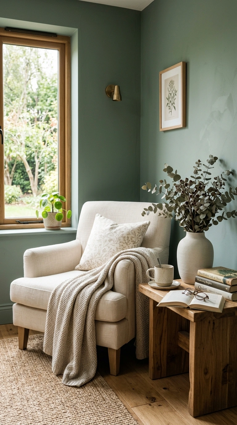
A soft, muted eucalyptus green brings a gentle, natural calm into a living room, sitting somewhere between sage and gray in its overall tone. This shade works especially well in rooms with plenty of natural light, since the softness of the color needs bright conditions to really show its full range of gray and green undertones throughout the day.
Pair eucalyptus green with cream, soft white trim, and warm wood furniture to build a calm, natural-feeling living room. This color also pairs beautifully with dried or fresh eucalyptus branches as a decor accent, tying the wall color directly into the room’s styling. Use an eggshell finish for a soft, low-glare look. This shade works particularly well in living rooms that also function as a quiet reading space, since the calm, natural tone helps the whole room feel a bit slower and more restful throughout the day.
23. Warm Mushroom Gray
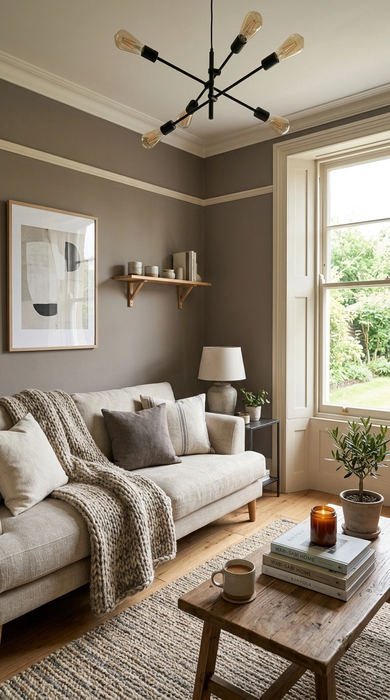
A soft, warm mushroom gray creates one of the most versatile calming neutrals available, sitting somewhere between beige, brown, and gray depending on the light in the room. This shade works well in nearly any living room style, since its warmth keeps it from feeling cold while its gray undertone keeps it from feeling overly beige or dated.
Pair mushroom gray with cream trim, warm wood furniture, and a mix of soft textiles like linen and wool to build a calm, layered living room. This color also works beautifully with black metal accents or brass lighting, depending on the overall style of the room. Use an eggshell or satin finish for a soft, subtle glow. This shade is a dependable, calming choice for anyone who wants a neutral living room color that will still feel current and warm for years to come.
Final Thoughts
Choosing a calming paint color for your living room really comes down to how the room is used and how much natural light it gets throughout the day. Grab a few sample pots from this list, paint some poster board swatches, and move them around the room over a few days before committing. The right shade will make the whole space feel like somewhere you actually want to slow down and relax.

Leave a Reply